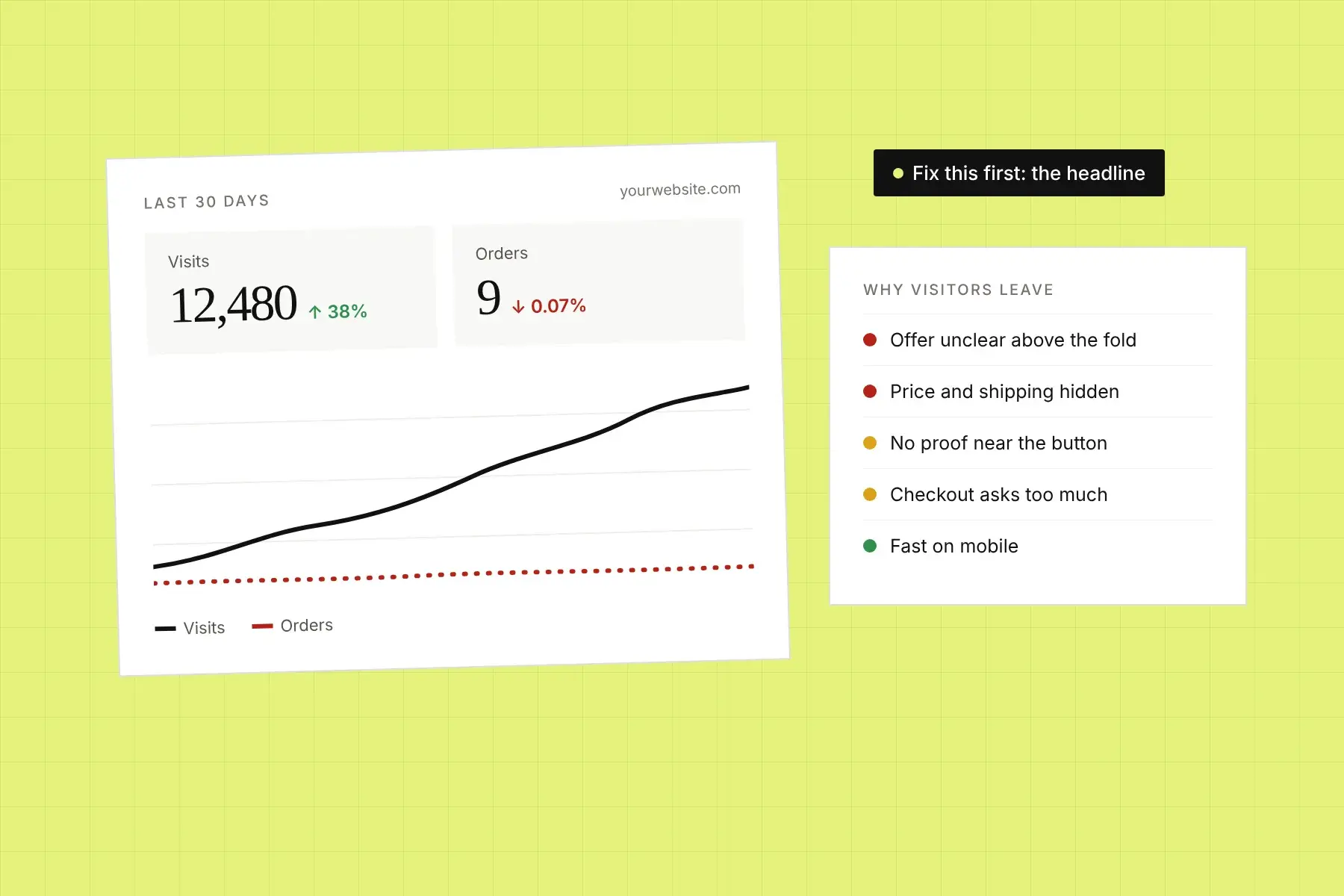
Your analytics show people arriving every day. Your sales dashboard shows almost nothing. It’s one of the most frustrating places a business can be, because the usual advice (“get more traffic”) makes it worse. More visitors on a page that doesn’t convert just means more people leaving.
The short answer: when a website gets traffic but no sales, the cause is almost always one of three things. The visitors aren’t the right people. The page doesn’t convince the right people quickly enough. Or something between “I want this” and “I bought it” is getting in the way. This guide shows you how to work out which one is yours and what to fix first.
Why does my website get traffic but no sales?
A website gets traffic but no sales when visitors arrive but don’t find a clear, credible reason to act right away. The most common causes are traffic that doesn’t match the offer, a page that doesn’t explain what you sell within a few seconds, missing trust signals, a weak or confusing call to action, and friction on mobile or at checkout.
Notice what’s not on that list: your product. Plenty of good products sit on pages that don’t sell them. Before you change your pricing, your offer, or your ad budget, check whether the page is doing its job.
Is the problem my traffic or my website?
To tell whether the problem is your traffic or your website, compare conversion rates by traffic source, device, and landing page. If one source converts and another doesn’t, it’s a traffic problem. If every source converts poorly on the same page, it’s a website problem. If desktop converts and mobile doesn’t, it’s a mobile experience problem.
You can do this in Google Analytics, Shopify Analytics, or whatever you use. Look at the last 30 to 90 days and break conversions down three ways:
- By source. Organic search, paid ads, social, email, referrals. A source with lots of sessions and almost no conversions is sending you the wrong people, or sending the right people to the wrong page.
- By device. If mobile gets most of your visits but a small share of your sales, the problem is the mobile experience, not your offer.
- By landing page. The page someone lands on matters more than your homepage. Find the pages that get the most entrances and the fewest conversions. Those are the pages worth fixing first.
Also check engagement on those pages. High bounce rates and very short visits point to a first-impression problem. Visitors who scroll, click around, add to cart and then leave point to a problem further down: price, shipping, trust, or checkout.
What are the most common reasons visitors don’t buy?
Most visitors leave without buying for a small set of fixable reasons: the page doesn’t match what they were looking for, the offer isn’t clear, they don’t trust the business yet, the next step is confusing, or the site is slow or awkward on their phone. Here are the ten we see most often, roughly in the order visitors hit them.
1. The traffic doesn’t match the page
Someone searched “how to fix a squeaky door hinge” and landed on your hinge product page. They wanted an answer, not a purchase. Or your ad promised 20% off and the page doesn’t mention it. When the page doesn’t match what the visitor expected, they assume they’re in the wrong place and leave.
Fix: Look at the search terms and ads that send traffic to each page. Make the first line of the page repeat the promise that brought people there. For informational searches, send visitors to a helpful guide that links to the product instead of straight to a product page.
2. Visitors can’t tell what you sell in five seconds
Headlines like “Elevate your everyday” or “The future of work is here” describe a feeling, not a product. A first-time visitor has no idea what you do, who it’s for, or why it’s better. They won’t scroll to find out.
Fix: Say what it is and what it does for the customer, in plain words, above the fold. If you want a repeatable way to test this, use our guide on how to evaluate a landing page’s first impression.
3. The call to action is buried or competing
If the top of your page has five buttons (“Shop now,” “Learn more,” “Watch video,” “Join the list,” “Book a call”), visitors have to decide which one matters. Many decide none of them do. Others can’t find the button at all, because it’s the same color as everything around it.
Fix: Choose one primary action per page. Make it the most visually obvious element on the screen, and say what happens when you click it: “Start your free trial” beats “Get started.”
4. Price, shipping, or terms are hidden
Visitors who can’t find the price assume it’s high. Visitors who find surprise shipping costs at checkout abandon the cart. Visitors who can’t see the return policy hesitate. Every unanswered question is a reason to “think about it,” and most people who leave to think about it don’t come back.
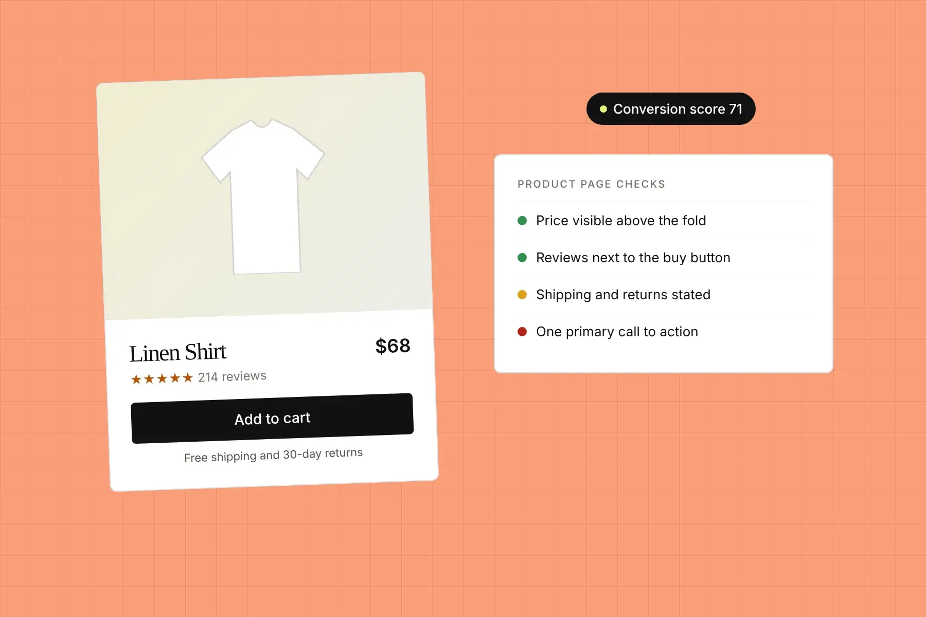
Fix: Show the price (or a starting price) on the page. State shipping costs and delivery times before checkout. Put your return or cancellation policy in one short line near the buy button.
5. Nothing proves you’re a real, trustworthy business
A new visitor doesn’t know you. Without reviews, customer names, recognizable logos, a real address, or a face behind the business, buying from you feels like a risk. Testimonials hidden at the bottom of the page don’t help someone deciding at the top.
Fix: Put your strongest, most specific proof right next to the main call to action. “Cut our onboarding from three weeks to four days” does far more than “Great product!”
6. The mobile experience is broken or awkward
For most sites, the majority of visits now come from phones, but pages are still designed and reviewed on a laptop. On mobile, the headline wraps into six lines, the buy button sits below three screens of images, pop-ups cover the content, and form fields are too small to tap.
Fix: Review your top pages on a real phone, not a resized browser window. Check that the headline, price, and main button are visible without much scrolling, and that nothing overlaps or needs zooming.
7. The page is slow
Slow pages lose visitors before they see anything. The usual culprits are huge hero images and videos, too many apps or tracking scripts, and fonts loaded from several places.
Fix: Compress images, remove apps and scripts you don’t use, and test speed on a mobile connection. Google’s PageSpeed Insights is free and points to the biggest offenders.
8. The form or checkout asks for too much
Every extra field, forced account creation, or surprise step costs you buyers. B2B sites often ask for phone number, company size, and job title just to download a PDF. Stores often force sign-up before checkout.
Fix: Ask only for what you need to complete the sale or the first conversation. Offer guest checkout and express payment options like Apple Pay, Google Pay, or Shop Pay. Our guide to signup flow optimization covers this in more detail for SaaS.
9. Something is actually broken
Sometimes “no sales” really does mean “no sales are possible.” A checkout button that fails on Safari. A contact form that sends to an old inbox. A discount code that errors. A payment method that stopped working after an app update. Or the sales are happening, but your tracking stopped recording them.
Fix: Place a real test order or submit your own form, on both desktop and mobile, at least once a month. Compare your analytics conversions with your actual orders or leads to make sure tracking is right.
10. The site looks generic
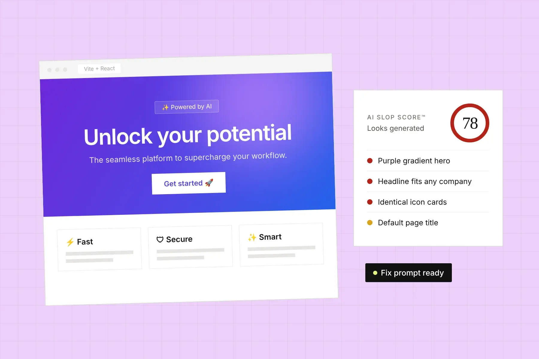
Visitors have seen thousands of template sites. Stock photos, vague copy, and a layout that could belong to any company signal that nobody put much care in, and that makes it harder to trust you with money. This is especially common on sites built quickly with templates or AI builders. We cover the specific patterns in how to tell if your website looks AI-generated.
Fix: Replace stock imagery with real photos of your product, team, or work. Rewrite any line that a competitor could use unchanged.
Is my conversion rate actually low?
Whether your conversion rate is low depends on your industry, price point, and traffic source, so broad averages are only a rough guide. Commonly cited ranges put many online stores somewhere around 1% to 3% of sessions, with lead generation pages varying much more widely. The better comparison is your own site by source, device, and page.
A $20 impulse product and a $5,000 piece of software will never convert at the same rate, and neither will cold social traffic and returning email subscribers. Use benchmarks to spot extreme cases (a page converting at 0.1% with plenty of traffic has a real problem), then focus on improving your own numbers month over month.
What should I fix first when a website isn’t converting?
Fix the page that gets the most traffic and converts the worst, and start at the top of that page. Problems in the first screen affect every visitor, while problems at checkout only affect people who got that far. Clarity first, then the call to action, then trust, then friction, then speed and polish.
A practical order of work:
- Confirm nothing is broken: test the buy button, forms, and checkout on desktop and mobile.
- Pick your highest-traffic, lowest-converting landing page.
- Rewrite the headline and subheadline so a stranger understands the offer in five seconds.
- Reduce the top of the page to one clear call to action.
- Move your best proof next to that call to action.
- Show price, shipping, and returns before checkout.
- Fix the mobile layout and page speed.
- Measure for a few weeks, then move on to the next page.
How long should I wait to see if a change worked?
Wait until you have enough visits and conversions to see a real difference, which for most small sites means at least two to four weeks per change. Judging a change after a few days, or after a handful of orders, mostly measures random noise, weekly cycles, and promotions rather than the change itself.
If your traffic is low, make bigger, clearer changes instead of small tweaks, and compare whole months rather than days. A new headline that changes what the page says will show up in the numbers much faster than a different button color.
How can I find out exactly what’s stopping visitors from buying?
The fastest way to find out what’s stopping visitors is to see your page the way a first-time visitor does, on desktop and mobile, and check it against the patterns above. You can do this by hand, with user testing, or with an automated website audit that flags conversion, trust, and mobile problems in one pass.
That’s what Honello does. Paste a URL and it reviews the live page on desktop and mobile, scores it on conversion, clarity, trust, mobile experience, and SEO, and gives you a ranked list of specific fixes, with the single highest-impact change first. Every finding points to the element on the page, so you can fix it yourself or hand it to your developer. Your first scan is free.