How to Evaluate a Landing Page’s First Impression Objectively
Learn a repeatable, criteria-based method to objectively assess what new visitors experience in the first few seconds on any landing page.
The Honello TeamUpdated 7 min read
You’ve probably heard that visitors form an opinion about a website in about 50 milliseconds. That’s not a metaphor. It’s a well-documented finding from research out of Carleton University, and it means that before anyone reads a single word on your page, they’ve already decided how they feel about it. The frustrating part is that most teams evaluate their own landing pages the way they evaluate their own cooking: with way too much familiarity to see it clearly. You know what the page is supposed to say, so you fill in the gaps. A new visitor doesn’t have that luxury. This guide gives you a repeatable, criteria-based framework for assessing first impressions the way a stranger would, so you can stop guessing and start fixing the right things.
Why subjective gut checks don’t work for landing page audits
The biggest problem with asking your team “does this page look good?” is that everyone on the team has context that real visitors don’t have. They know the brand, the product, the campaign this page is tied to. Their judgment is contaminated before they even load the URL. What you need instead is a structured set of criteria that can be applied consistently, regardless of who’s doing the review or how familiar they are with the product. Think of it like a checklist a pilot uses before takeoff. It’s not that pilots don’t know how to fly. It’s that checklists remove the variability that comes from relying on memory and mood.
A criteria-based approach also gives you something you can track over time. If you run the same evaluation framework before and after a redesign, you’ll know whether things actually improved, not just whether the new version feels fresher to the people who built it.
What the “first few seconds” window actually measures
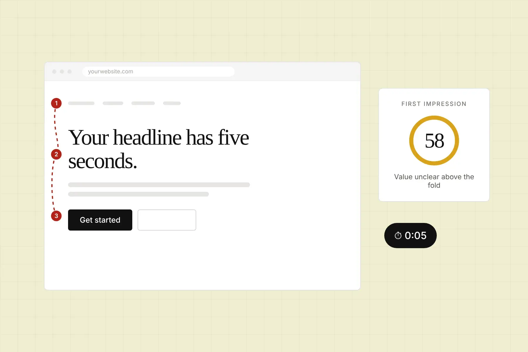
When UX researchers talk about first impressions, they’re really talking about two overlapping windows. The first is that sub-second aesthetic judgment, where the brain decides whether the page looks trustworthy and professional. The second is the three-to-five second comprehension window, where a visitor tries to answer three questions without consciously thinking about them: Where am I? What can I do here? Why should I care?
Your evaluation framework needs to cover both windows. The aesthetic layer is about visual design signals: color, spacing, imagery quality, font clarity, and whether the page looks current or outdated. The comprehension layer is about messaging and structure: does the headline communicate a clear value proposition, is the primary call to action obvious, and does the above-the-fold layout guide the eye in a logical direction?
How to set up an objective first impression evaluation
Before you start scoring anything, you need to simulate the experience of a new visitor as accurately as possible. That means viewing the page in a fresh browser with no cookies, no autofill, and ideally no prior exposure to the brand in the last hour or two. Check both desktop and mobile versions separately, because they often behave completely differently and many teams only review desktop. Mobile traffic regularly makes up 60 percent or more of visits for most landing pages in 2026, so skipping the mobile check is like proofreading only the first half of a document.
Set a timer for five seconds, load the page, then close it. Write down what you remember. This forces you to capture only what actually registered, not what you think should have registered. Then reopen the page and use the criteria below to do a structured pass.
Criterion 1: clarity of the value proposition
The headline and subheadline should answer “what is this and why does it matter to me” within a single glance. Score this on a simple three-point scale: the value proposition is immediately clear, it requires reading more context to understand, or it’s unclear even after reading the full above-the-fold section. Be honest here. “Transforming the future of work” is not a value proposition. “Project management software for remote engineering teams” is.
Criterion 2: visual hierarchy and focal point
When you look at the page without reading anything, where does your eye go first? There should be one dominant focal point, usually a headline or hero image, followed by a natural path down the page. If your eye bounces around or lands on something decorative rather than informational, the hierarchy is broken. Ask yourself whether the most important element on the page is also the most visually prominent one. If those two things don’t match, that’s a concrete finding worth addressing.
Criterion 3: call to action visibility
Without scrolling, can you find the primary call to action? Can you tell what happens when you click it? A button that says “Get Started” is better than one that says “Submit,” but neither is as good as “Start your free trial.” Evaluate button placement, contrast against the background, and specificity of the label. If there are multiple CTAs competing for attention above the fold, that’s a flag too. Competing CTAs dilute each other’s effectiveness.
Criterion 4: trust signals in the first viewport
New visitors arrive skeptical, especially if they came from a paid ad or an unfamiliar referral source. Trust signals are the elements that lower that skepticism quickly: logos of well-known clients, a recognizable security badge, a concrete number like “used by 14,000 businesses,” a short testimonial near the top, or even a professional-looking design that signals the company is legitimate. Score whether any trust signals are visible above the fold and whether they’re credible-looking or feel generic and stock-photo-ish.
Criterion 5: mobile experience parity
Load the mobile version and check whether the value proposition is still readable without zooming, whether the CTA is tappable and not buried below a wall of text, and whether any key elements from the desktop version have been hidden or collapsed into something that no longer communicates the same message. Mobile-specific issues like oversized hero images that push content below the fold, tiny tap targets, or horizontally scrolling layouts are extremely common and often go unnoticed because the team does most of their reviewing on desktop.
How to score and document your findings consistently
The point of a structured evaluation isn’t just to identify problems, it’s to prioritize them. Not every issue has the same impact on conversions. A broken CTA button matters more than an imperfect font pairing. To make your findings actionable, assign each issue a severity level. You might use something as simple as high, medium, or low. Then sort your list by severity before handing it off to anyone for fixes. The person who acts on your audit should be able to open the list and immediately know where to start, without needing to read a 40-page report first.
It also helps to document findings with screenshots and specific element references, not just vague descriptions. “The headline is hard to read” is less useful than “the white headline on the light gray hero background has insufficient contrast, specifically in the mobile view.” Specificity is what turns an audit into a repair checklist.
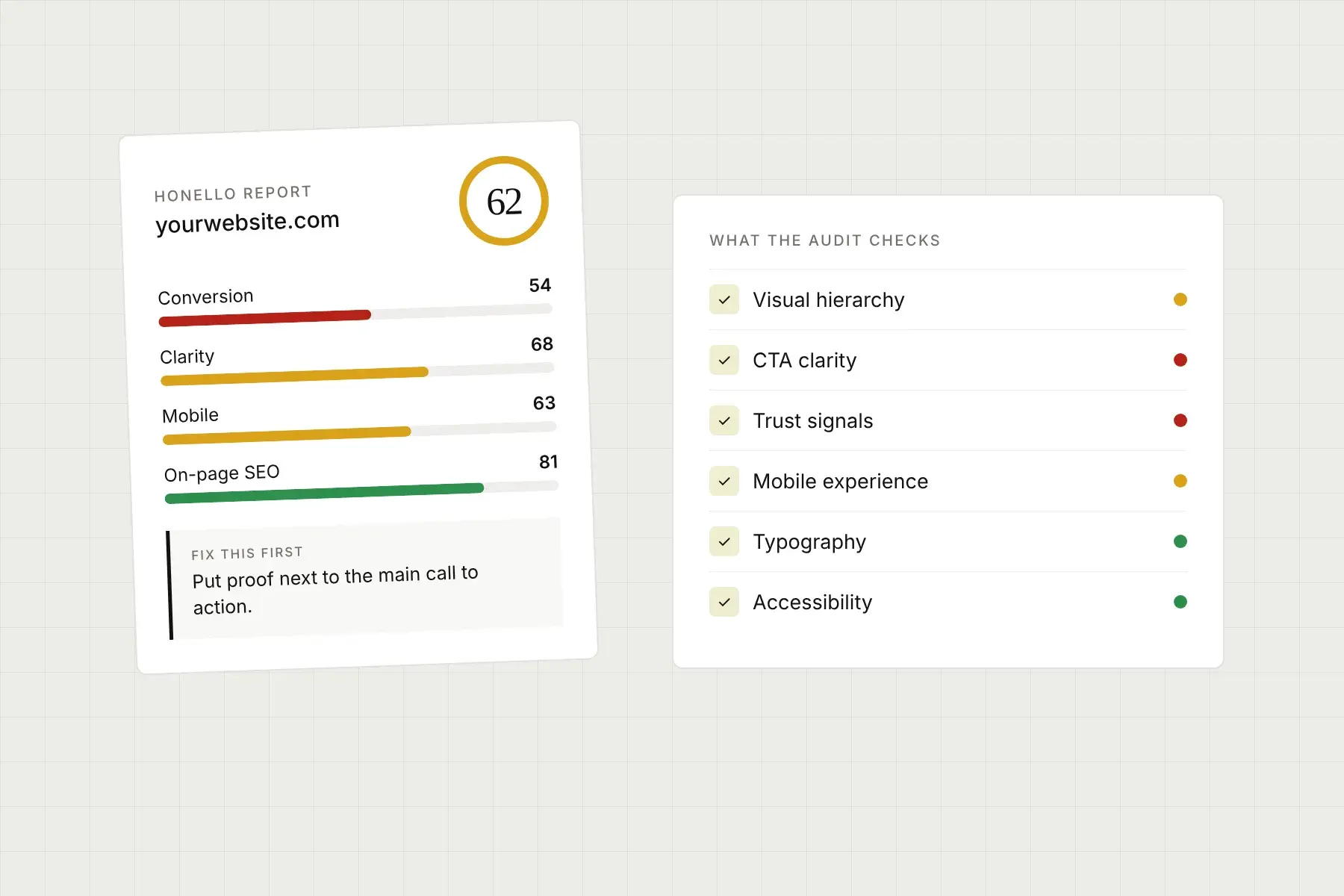
This is exactly the kind of structured, prioritized output that tools like Honello are built to produce. Instead of manually walking through each criterion for every page you need to evaluate, you can paste a URL into Honello and get a scored audit across more than 10 dimensions including visual hierarchy, CTA effectiveness, trust signals, and first impression clarity, for both desktop and mobile. It captures what an actual visitor sees and evaluates the page against established UX and UI principles, then ranks the findings so your team always knows which fix to tackle first. For agencies auditing multiple client sites, or for lean startup teams who need expert-level feedback without the consultant timeline, that kind of automated, criteria-based output is genuinely useful.
How often should you run a first impression evaluation?
At minimum, run a structured evaluation any time you make a significant change above the fold: a new headline, a different hero image, a revised CTA, or a layout update. Also run one whenever conversion rates dip unexpectedly, because the cause is often something visible in the first viewport that got quietly broken during a site update. Seasonal campaigns and new ad landing pages should each get their own pass before launch, not after.
If you’re running ongoing conversion rate optimization, a monthly or quarterly cadence makes sense. First impressions aren’t a one-and-done thing because visitor expectations evolve, competitors update their pages, and what felt modern and trustworthy two years ago can start to look dated. Treating your landing pages as a living system rather than a finished product is what separates teams that consistently improve conversion rates from teams that wonder why their pages aren’t performing.
What to do after you complete the evaluation
Once you’ve scored the page across your criteria and ranked your findings by impact, resist the urge to try to fix everything at once. Pick the single highest-impact change, implement it cleanly, and measure the result. This isn’t just good project management, it’s good science. When you change multiple things at once, you can’t tell which change actually moved the needle. Isolated changes give you real data to learn from, and that data makes every future evaluation more useful because you’re building a picture of what specifically works for your audience.
A well-run first impression audit is one of the highest-leverage activities you can do for a landing page. It’s fast, repeatable, and doesn’t require any special tools or large budgets to do at a basic level. But when you need to do it consistently, at scale, across multiple pages or client sites, having a systematic way to capture and score every dimension quickly is what keeps the process from becoming a bottleneck.
If you want to see how your landing page holds up against a structured, multi-criteria evaluation without spending hours doing it manually, give Honello a try. Just paste your URL, no installs, no code, no waiting. You’ll get a full scored audit of your desktop and mobile experience with specific, prioritized findings and concrete fixes you can hand straight to your developer. Whether you’re an ecommerce brand, a SaaS team, a local service business, or an agency managing a stack of client sites, Honello gives you the kind of expert-level UX clarity that usually takes a consultant and a week’s worth of back-and-forth to produce. Explore plans at honello.com/pricing or get started for free at honello.com/sign-up.
See what your visitors see.
Run a free scan and get a prioritized list of conversion, SEO, and UX fixes for your site in under 5 minutes.