How to Increase Shopify Sales: Improving Your Store
Want more Shopify sales? Learn proven strategies to boost conversions, reduce cart abandonment, and turn more visitors into buyers starting today.
The Honello TeamUpdated 8 min read
Getting traffic to your Shopify store is one thing. Getting that traffic to actually buy something is a completely different challenge. If you’re sitting on decent visitor numbers but your revenue isn’t reflecting it, the problem almost certainly lives somewhere on your website itself. The good news is that most of the issues holding Shopify stores back are fixable, and many of them don’t require a full redesign or a massive ad budget. They just require knowing where to look.
Why your Shopify store might not be converting
Before you throw more money at ads or spend weeks tweaking your product descriptions, it’s worth understanding what’s actually stopping people from buying. The average ecommerce conversion rate sits somewhere between 2% and 4%. If you’re below that, something on your site is creating friction. And friction is almost always invisible to the store owner because you know your own site too well. You know where everything is, you trust your brand, and you’ve already mentally skipped past all the moments of hesitation that a first-time visitor experiences.
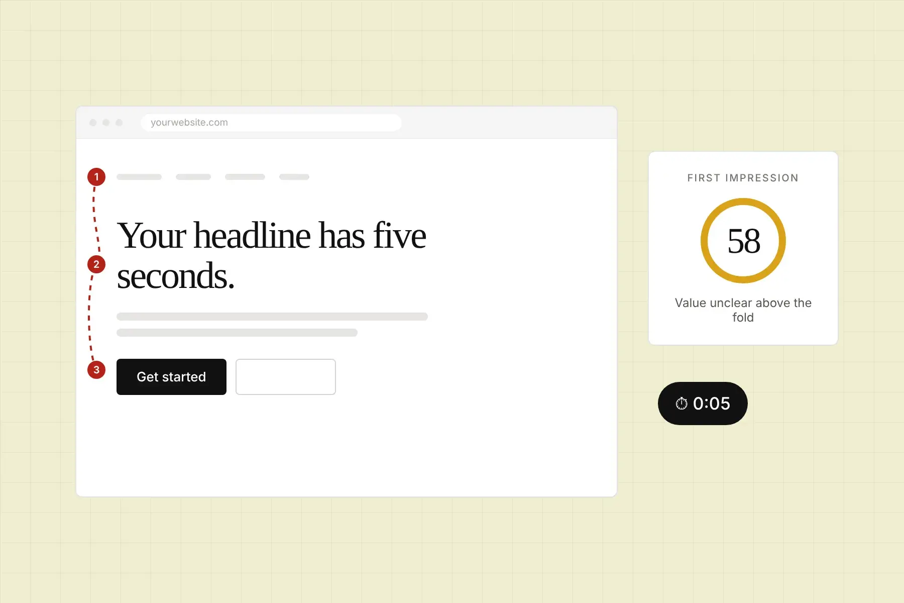
That’s the core problem. You’re not your customer. A new visitor lands on your store with zero context, zero trust, and roughly 3 to 5 seconds to decide whether it’s worth their time. If your layout is confusing, your value proposition isn’t immediately clear, or your trust signals are buried or missing entirely, they’re gone. And most of the time, they’re not coming back.
How to optimize your Shopify product pages for more sales
Your product pages are doing the heavy lifting. They’re where the decision actually gets made, which means they deserve more attention than almost any other part of your store. Here’s what actually moves the needle.
What should your product images look like?
High-quality photography is non-negotiable. But it’s not just about resolution. You need images that show scale, context, and detail. Lifestyle photos help shoppers picture themselves using the product. Close-ups build confidence that the quality is real. If you sell anything with size variability, include a photo with a size reference object. Shoppers can’t touch your product, so your images have to do the sensory work for them.
Make sure your images load fast too. Bloated image files are one of the most common reasons Shopify stores bleed conversions without realizing it. Compress everything before uploading, and use modern formats like WebP where your theme supports it.
How should you write product descriptions that sell?
Most product descriptions read like a spec sheet. Bullet points listing dimensions, materials, and features. That information matters, but it’s not what closes a sale. What closes a sale is helping the customer understand how the product improves their life. Lead with the benefit, then back it up with the specifics. Keep sentences short. Use formatting like bold text and short lists to make scanning easy, because almost no one reads linearly.
Also, don’t ignore search intent here. Product descriptions are indexed by Google. Including natural, specific language that mirrors how real people search for your product category can drive meaningful organic traffic over time.
How to reduce cart abandonment on Shopify
Cart abandonment is the most emotionally frustrating problem in ecommerce. Someone picked out your product, added it to their cart, and then left. The average cart abandonment rate is around 70%, which means you’re losing the majority of people who are already nearly at the finish line. Getting that rate down by even 10% can have a significant impact on your revenue.
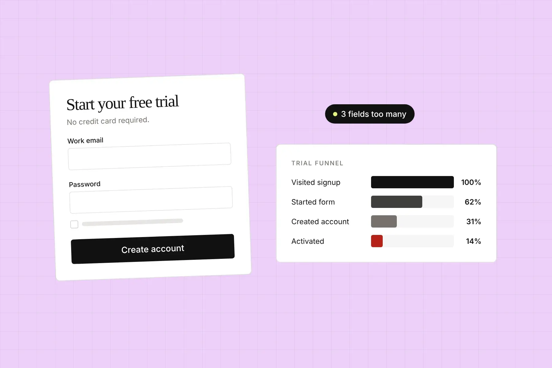
The biggest culprits are surprise costs at checkout (shipping fees, taxes that weren’t mentioned earlier), a checkout flow that asks for too much information, and a lack of visible trust signals at the moment of payment. Fix those three things and you’ll recover a meaningful chunk of abandoned carts before you even touch retargeting emails.
Speaking of which, automated cart abandonment emails are still one of the highest-ROI tools available to Shopify stores. Shopify’s built-in automation makes this straightforward to set up. A well-timed sequence of two or three emails, with the first going out within an hour of abandonment, can recover 5% to 15% of those carts. That’s money you’ve already earned in attention and intent.
What trust signals actually increase Shopify conversions?
Trust is the invisible currency of ecommerce. Shoppers are constantly making micro-assessments of whether your store is legitimate, whether the product will actually arrive, and whether you’ll make things right if something goes wrong. Every element of your site either adds to that trust or chips away at it.
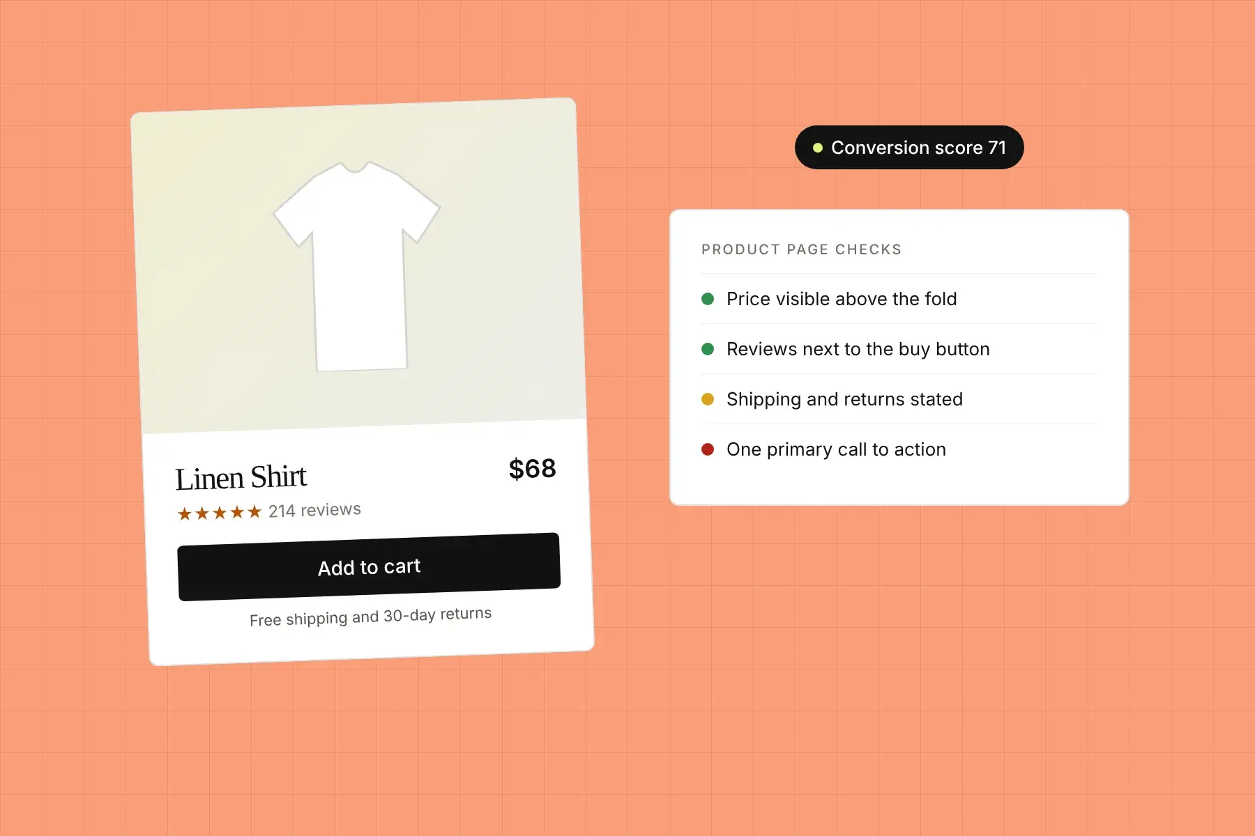
The trust signals that consistently move conversion rates include customer reviews and ratings, especially ones with photos. A store with 200 reviews and a 4.3-star average will almost always outperform a store with a perfect 5.0 from just 8 reviews. Real looks more trustworthy than perfect.
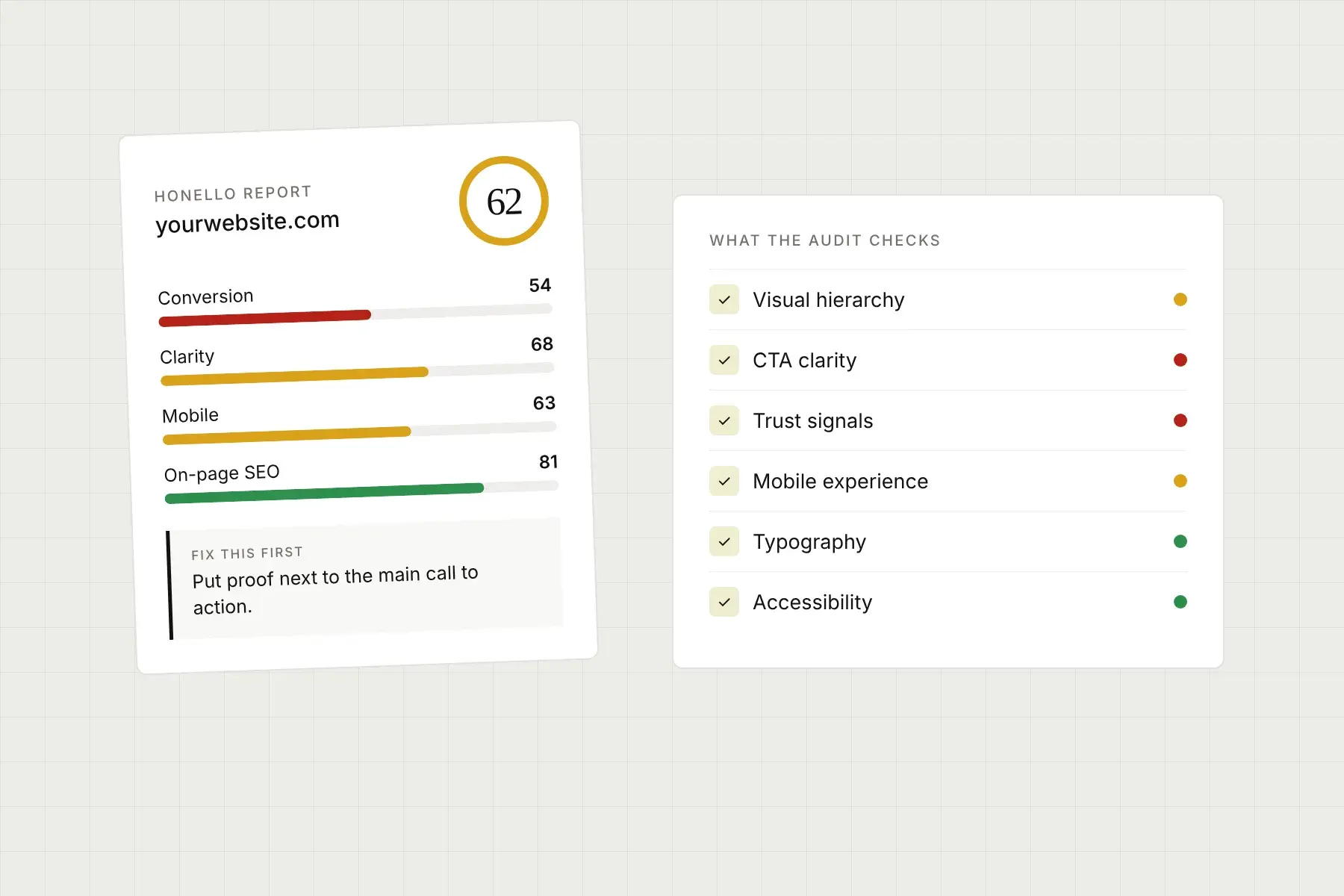
Other high-impact trust signals include a clear and generous return policy (make it prominent, not buried in the footer), security badges near your checkout button, real contact information including a phone number or chat option, and social proof like press mentions or user-generated content. Running an AI-powered audit of your store can surface exactly which of these signals are missing or misplaced on your specific pages. Tools that score your site across dimensions like trust signals and first impression clarity can show you what a first-time visitor actually sees, which is often quite different from what you think they see.
How does site speed affect Shopify sales?
Every second of load time costs you conversions. Google’s data consistently shows that pages taking longer than 3 seconds to load lose more than half their mobile visitors before the page even finishes rendering. On mobile especially, speed is a competitive advantage, and most Shopify stores are slower than they should be because of heavy apps, uncompressed assets, or bloated themes.
Run your store through Google’s PageSpeed Insights tool and look at your Core Web Vitals. Pay particular attention to Largest Contentful Paint (which measures how fast your main content loads) and Cumulative Layout Shift (which measures visual stability as the page loads). Both have a direct impact on how users experience your store and how Google ranks it.
On the Shopify side, audit the apps you have installed. Every app you add injects code into your store, even if you’re not actively using its features on the front end. Removing unused apps and consolidating overlapping tools can meaningfully improve load times without touching your design at all.
How to use your Shopify store’s mobile experience to drive more revenue
More than 60% of ecommerce traffic comes from mobile devices, and in many product categories that number is even higher. But mobile conversion rates consistently lag behind desktop, which tells you that most stores are not actually optimized for the experience the majority of their visitors are having.
Mobile optimization isn’t just about making your desktop layout shrink down responsibly. It requires thinking about touch targets (are your buttons large enough to tap without frustration?), thumb-friendly navigation, checkout flows that work smoothly with autofill and mobile keyboards, and images that still communicate clearly on a smaller screen.
One of the fastest ways to find your mobile-specific issues is to walk through your store on an actual phone you don’t normally use. Better yet, have someone who’s never seen your store walk through it while you watch. The places where they hesitate or get confused are the exact places you’re losing conversions. Platforms that analyze your desktop and mobile experience side by side and evaluate them against real UI and UX principles can surface these gaps much faster than manual testing, especially when they give you a prioritized list of specific fixes rather than a vague report you have to interpret yourself.
What role does visual hierarchy play in Shopify conversions?
Visual hierarchy is how your page guides a visitor’s eye toward the action you want them to take. On a product page, that’s the add-to-cart button. On a homepage, it might be a shop-now CTA or a featured collection. If your page doesn’t have a clear visual hierarchy, visitors wander. Their eye doesn’t know where to go, so they bounce.
Strong visual hierarchy uses contrast, size, spacing, and color to create a clear path through the page. Your most important element should be the most visually dominant. Your call to action should stand out from its surroundings, not blend into them. This sounds basic, but a huge number of Shopify stores have CTAs that are nearly invisible because they use a color that’s too close to the background or a font size that doesn’t command attention.
Reviewing your store through the lens of visual hierarchy often reveals quick wins that require only minor CSS tweaks but have an outsized impact on how many people actually click. If you’re not sure where your hierarchy is breaking down, an objective audit that scores your site specifically on visual hierarchy and CTA effectiveness can give you clear, actionable direction without the guesswork.
How to use social proof and urgency to increase Shopify sales
Social proof and urgency are two of the most reliably effective psychological drivers in ecommerce. Social proof reduces perceived risk. Urgency reduces decision paralysis. Used honestly and thoughtfully, both can significantly increase your conversion rate.
For social proof: prioritize getting reviews on your most popular products. Use Shopify’s native review tools or a dedicated app. Showcase user-generated content from real customers. Display how many people have purchased a product recently if your numbers are strong enough to be impressive. Feature any media mentions you’ve earned.
For urgency: show real stock levels when inventory is genuinely low. Use countdown timers for limited-time offers only when the offer is actually limited. Fake urgency is one of the fastest ways to destroy trust the moment a shopper notices it.
Neither tactic requires a redesign. Both can be implemented within your existing Shopify setup and tested quickly to see the impact on your conversion rate.
If you want to grow your Shopify sales without guessing, start by understanding exactly what’s broken on your site right now. Honello is an AI-powered website auditing tool that analyzes your desktop and mobile experience in minutes, scoring your store across more than 10 dimensions including visual hierarchy, CTA effectiveness, trust signals, and first impression clarity. There’s nothing to install and no code required. You just paste in your URL and Honello captures what your visitors actually see, evaluates it against industry-leading UI and UX principles, and delivers a prioritized list of specific findings and concrete fixes, starting with the single highest-impact change your team should make first. Every finding points to the exact element on the page so you can hand it straight to your developer and start shipping improvements today. Explore plans at honello.com/pricing or get started for free at honello.com/sign-up.
See what your visitors see.
Run a free scan and get a prioritized list of conversion, SEO, and UX fixes for your site in under 5 minutes.