AI builders like Lovable, Bolt, v0, Replit, and Cursor can take you from idea to live website in an afternoon. The catch is that they tend to produce the same website. Same gradient, same hero, same three feature cards, same reassuring copy that says nothing. Visitors may not know why your site feels off, but they notice, and it costs you their trust.
The short answer: a website looks AI-generated when its design and copy follow the default patterns AI tools produce, instead of anything specific to your business. The fix isn’t to hide that you used AI. It’s to replace every generic element with something only your business could say or show.
Why does it matter if my website looks AI-generated?
It matters because visitors judge whether a website is credible mostly by how it looks, and they do it before reading much. A site that looks generated signals low effort, which makes people less willing to trust the business with their money or their email address. That shows up as higher bounce rates and fewer signups or sales, even when the product is good.
This isn’t new. In Stanford’s long-running Web Credibility Research, the look of a site was the factor people mentioned most often when explaining whether they found it credible. What’s new is how many sites now share the same look, which makes the pattern easy to spot and easy to dismiss.
It also matters for search. A page full of generic copy gives Google and AI assistants nothing specific to rank or quote, so it tends to be outranked by pages that say something concrete.
What are the signs a website was built with AI?
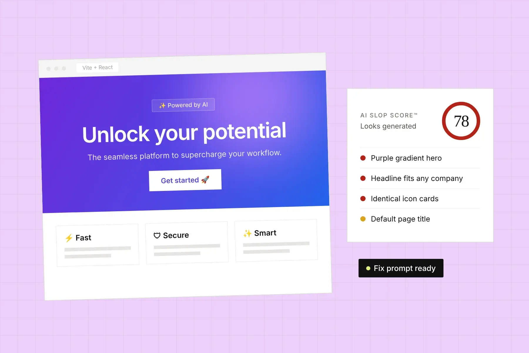
The clearest signs a website was built with AI are default visual choices (purple-to-blue gradients, glowing blobs, identical icon cards), vague copy that could describe any company, invented social proof, and missing basics like a real page title or favicon. One or two of these is normal. When most of them show up together, visitors read the site as a template.
Design patterns
- The purple-to-blue gradient. On the hero background, on buttons, on headline text. It’s become the unofficial color scheme of AI-built sites.
- Blurry glowing blobs behind the hero, or “glass” cards with frosted backgrounds and soft glows on everything.
- Three (or six) identical feature cards, each with an outline icon, a two-word title, and one vague sentence. Lightning bolt for “Fast,” shield for “Secure,” sparkles for “AI-powered.”
- Emoji used as icons in headings and feature lists. 🚀 ✨ 💡
- The same rhythm on every section. Centered heading, centered subheading, grid of cards, repeat. Nothing breaks the pattern, so nothing stands out.
- No real images. Abstract shapes, generic illustrations, or a fake dashboard mockup instead of your actual product, team, or work.
Copy patterns
- Headlines that could belong to anyone. “Unlock your potential.” “Supercharge your workflow.” “The future of [category] is here.” If a competitor could use your headline unchanged, it isn’t doing its job.
- A familiar vocabulary. Seamless, effortless, elevate, empower, revolutionize, cutting-edge, game-changing, unleash. One is fine. A page full of them reads as filler.
- Claims with nothing behind them. “Trusted by thousands.” “Industry-leading.” “10x faster.” Without a number, a name, or a source, visitors skip right past them.
- Everything comes in threes. Three benefits, three adjectives, three steps, three pricing tiers named Starter, Pro, and Enterprise, whether or not that’s how your business works.
Social proof that isn’t real
- Testimonials from “Sarah J., CEO” with no company, no photo, and no specific result.
- A “Trusted by” logo row of placeholder logos or companies you’ve never worked with.
- Round-number stats like “10,000+ happy customers” on a product that launched last month.
Fake proof is worse than none. One visitor who notices it will distrust everything else on the page.
Technical leftovers
- A browser tab title like “Vite + React” or the name of the builder, instead of your page’s real title.
- The builder’s default favicon.
- Missing meta descriptions, missing alt text, and headings used for styling rather than structure.
- Footer links, social icons, and “Learn more” buttons that go nowhere.
- Content that only appears after JavaScript loads, so search engines and AI crawlers see an almost empty page.
How do I make an AI-built website look less generic?
To make an AI-built website look less generic, replace every default with something specific to your business: a headline that names your customer and outcome, real photos or product screenshots, proof with names and numbers, a color palette you chose on purpose, and layouts that vary to fit the content. Then fix the SEO basics your builder skipped.
- Rewrite the headline first. Say who it’s for and what changes for them: “Bookkeeping for Shopify stores, done by the 5th of every month” instead of “Effortless finance, reimagined.”
- Show the real thing. Replace mockups and illustrations with actual screenshots, product photos, or pictures of your work and team. Real images do more for trust than any design trick.
- Cut the feature cards down to what’s true and specific. Fewer, more concrete points beat a grid of six vague ones. Replace “Fast” with what fast means: “Reports in under 5 minutes.”
- Replace or remove fake proof. Use real reviews with names and details, or leave the section out until you have them.
- Pick your own colors and type. Choose a palette that fits your brand and drop the default gradient. Use contrast and size to create a clear hierarchy instead of glow effects.
- Vary the layout. Let important sections take more space. Not everything needs to be a centered grid of cards.
- Fix the technical leftovers. Set a unique title tag and meta description for each page, replace the favicon, add alt text, fix dead links, and make sure your content is in the page’s HTML.
Can I prompt Lovable, Bolt, or Cursor to fix it?
Yes. AI builders are good at making targeted changes when you tell them exactly what’s wrong and what to do instead. Prompts like “make it look less generic” produce more of the same. Name the specific elements, give the real content to use, and ask for changes one section at a time so you can review each result.
A prompt that works much better than “make it better”:
Update the homepage hero only. Remove the purple-to-blue gradient background and the glowing blob. Use a plain off-white background with dark text. Replace the headline with “Bookkeeping for Shopify stores, done by the 5th of every month.” Replace the subheadline with “We reconcile your payouts, fees, and refunds so your books match your bank.” Keep one button, “Book a free call,” and remove the secondary button. Don’t change any other section.Give the builder the facts it can’t invent: your real customers, numbers, prices, and photos. It can arrange them well. It can’t make them up without slipping back into generic copy.
Does Google penalize AI-generated websites?
Google doesn’t penalize content just because AI helped create it. Its guidance focuses on whether content is helpful, original, and made for people, and its spam policies target mass-produced pages with little value, however they were made. A generic AI-built site isn’t penalized for using AI, but it often ranks poorly because it says nothing specific enough to deserve a ranking.
The same applies to AI assistants. ChatGPT, Perplexity, and Google’s AI Overviews cite pages that answer questions specifically and credibly. Generic copy gives them nothing worth quoting. If AI search matters to you, our guide on how to get your website cited by ChatGPT and AI Overviews covers what to change.
Is it bad to use AI to build my website?
No. Using AI to build a website is a fast, sensible way to get something live, and plenty of good sites start that way. The problem is shipping the defaults. Treat the first version as a draft: keep the structure and code, then replace the generic design and copy with your own specifics before you send real traffic to it.
How can I check how AI-generated my website looks?
You can check by hand with the lists above: open your site next to two or three other AI-built sites and count the shared patterns. For a faster, more objective read, Honello’s AI Slop Score™ scans your live page for the patterns that make AI-built sites look AI-built and shows what to replace.
Every Honello report also checks conversion, UX, mobile, and the SEO basics builders skip, and gives you a fix prompt you can paste straight back into Lovable, Bolt, Cursor, or Claude Code. No repo access needed, just your URL. Start with a free scan.