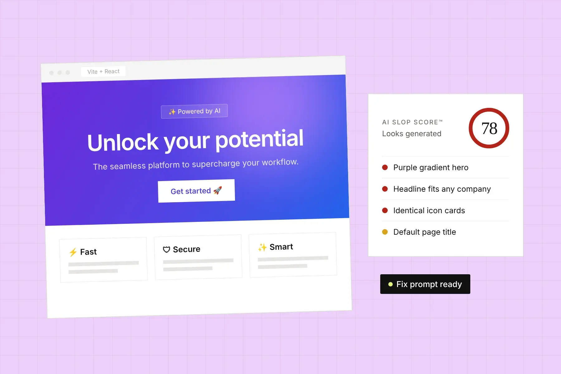
If you’ve looked at a few sites made with Lovable, Bolt, v0, or Cursor, you’ve seen it: a hero section that fades from violet to blue, a glowing purple blob behind the headline, indigo buttons, and maybe some gradient text. It’s become so common that many visitors now read a purple-to-blue gradient as “this was generated” before they’ve read a word.
The short answer: AI-built websites have purple gradients because the models that write them learned from a huge amount of code where indigo, violet, and purple are the default accent colors, and because purple-to-blue has come to signal “tech” and “AI.” Without a brand color in the prompt, the model picks the most common choice. Replacing it with two or three colors chosen from your own brand is one of the biggest single improvements you can make.
Where does the AI purple gradient come from?
The AI purple gradient comes from defaults stacked on top of each other. Most AI builders generate Tailwind CSS. Tailwind’s own component examples, and many of the starter kits and templates built on them, have long used indigo as the primary color. Models trained on that code learn that “a button” is usually indigo and “a hero” is usually a gradient. Add a few years of AI products marketing themselves with violet and blue, and purple-to-blue becomes the statistically safest way to make a page look modern.
None of this is a decision. It’s what happens when nobody makes one. That’s why it reads as generic: visitors aren’t reacting to the color purple, they’re reacting to the absence of a choice.
Why does a purple gradient make a website look AI-generated?
A purple gradient makes a website look AI-generated because visitors have now seen the exact same one on hundreds of other sites. Recognition is the problem. Once someone spots a pattern they associate with templates, they start looking for other signs, like generic copy, stock images, and identical feature cards, and each one confirms the impression.
That matters most where trust matters most. A visitor deciding whether to give you their card number or book a call is looking for evidence that a real business with real care is behind the page. Defaults are evidence of the opposite.
Is it bad to use purple on my website?
No. Purple is a perfectly good brand color. The problem is the default purple: the exact framework swatches, applied as a purple-to-blue gradient, because nothing else was specified. A brand that has chosen its own purple, uses it as a flat color, and pairs it with something unexpected won’t read as generated.
If purple is your brand color, keep it and make it yours:
- Use your exact shade, not Tailwind’s violet-500 or indigo-600. Even a small shift in hue or saturation stops it matching every other site.
- Use it flat. A solid block of your color reads as a brand. A violet-to-blue fade reads as a template.
- Pair it with a neutral that isn’t pure white or slate gray, such as a warm off-white, a deep green, or a near-black with some color in it.
Which colors does an AI slop check flag?
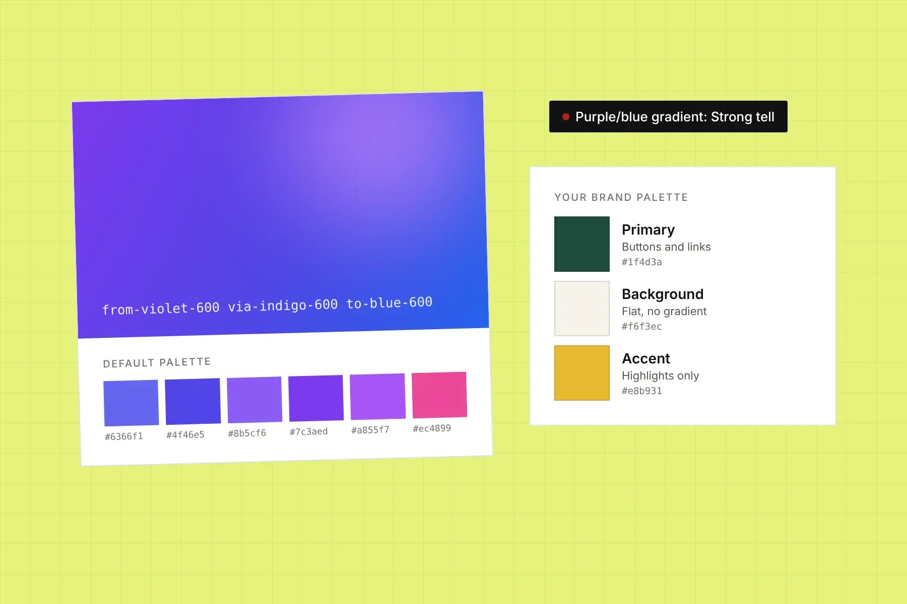
Honello’s AI slop checker flags two separate color patterns. The first is a linear gradient running through the indigo, violet, purple, or fuchsia range. Two or more on one page is a strong tell; one is borderline. The second is a palette left on framework defaults, measured by how many of the page’s text and background colors exactly match Tailwind’s stock swatches:
- indigo-500 and indigo-600
- violet-500 and violet-600
- purple-500 and purple-600
- blue-500 and blue-600
- pink-500 and pink-600
The check matches both Tailwind v3’s hex values (such as #6366f1 and #4f46e5) and Tailwind v4’s OKLCH values, so it works whichever version your builder used. Together, the gradient and palette checks carry more weight than any other part of the AI Slop Score™.
How do I find default colors in my site’s code?
Search your project for the default color utility classes. In most AI-built sites the colors live in class names rather than a stylesheet, so a plain text search finds them:
indigo-,violet-,purple-, andfuchsia-for accent colorsbg-gradient-to-orbg-linear-to-,from-,via-, andto-for gradientsbg-clip-textfor gradient headlinesblur-3xlor similar on absolutely positioned elements for the glowing blobs
If the project uses shadcn/ui, also look at the CSS variables in the global stylesheet (usually --primary and --accent). Changing them there updates every component at once.
How do I choose brand colors for my website?
Choose brand colors by starting from something that already belongs to you, not from a palette generator. Most small businesses need only three colors:
- A primary color for buttons, links, and the few things you want people to click. Take it from your logo, your packaging, your storefront, or your product itself.
- A neutral for backgrounds and text. Pure white and pure black are fine, but a slightly warm or cool off-white makes a page feel considered.
- One accent for highlights, badges, and illustrations, used sparingly. It should contrast clearly with your primary color.
Then check contrast. Your primary color needs to pass WCAG AA contrast against the text that sits on it (4.5:1 for normal text). Free tools like WebAIM’s Contrast Checker will tell you in seconds.
How do I prompt Lovable, Bolt, or Cursor to replace the purple gradient?
Give the builder exact hex values and tell it where each one goes. Asking it to “use a more unique color scheme” usually swaps one default for another, often teal or orange. A specific prompt works:
Replace the color scheme across the whole site. Primary: #1f4d3a (buttons, links, focus rings). Background: #f6f3ec. Text: #1a1a17. Accent: #e8b931 (badges and highlights only, never for text). Remove every gradient, including the hero background, gradient text, and blurred decorative blobs; use the flat background color instead. Remove all indigo, violet, purple, and fuchsia classes. If the project uses shadcn/ui, set --primary, --accent, --background, and --foreground in the global CSS to these values. Don’t change layout or copy.
Swap in your own colors, run it, then search the code again for the class names above. Builders tend to miss hover states, focus rings, and dark mode.
What should I use instead of a gradient hero?
Use the thing a gradient was standing in for: something that shows what you actually do. In rough order of how much trust they build:
- A real product screenshot or photo, cropped to the part that matters.
- Your work: a finished project, a happy customer, your team, your space.
- A flat block of your brand color with a strong headline, if you don’t have imagery yet.
- A custom illustration, if it’s genuinely yours and not a stock style.
A gradient isn’t forbidden. If you keep one, take it off the purple-blue-pink range and build it from your own brand colors so it couldn’t belong to anyone else.
What else makes a site look AI-generated?
Color is the most visible pattern, but rarely the only one. AI-built sites usually share several: the same few default fonts, gradient text and frosted-glass panels, a large border radius on everything, headlines full of words like “seamless” and “supercharge,” emoji used as icons, and grids of identical feature cards. Our guide on how to tell if your website looks AI-generated covers each one.
To see exactly which of these your page has, run it through the AI slop checker. It measures all nine patterns on your live page, scores how strongly each one shows up, and gives you a prompt to fix them in your builder.