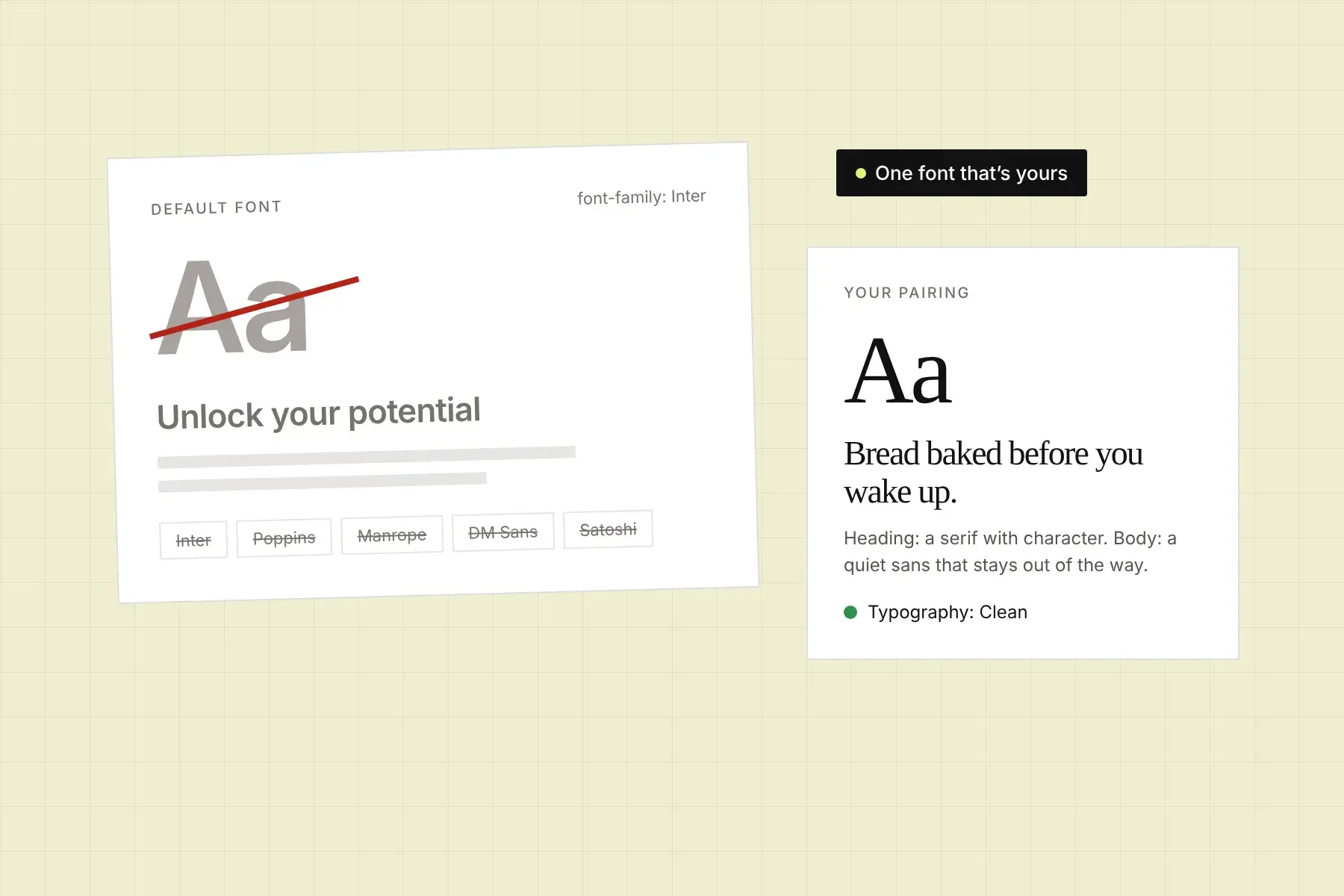
Open five sites built with an AI website builder and you’ll see the same handful of fonts: Inter, Poppins, Manrope, Plus Jakarta Sans, DM Sans, Space Grotesk. They’re good fonts. That’s the problem. They’re the safe, statistically likely choice, so every builder and every coding assistant reaches for them, and visitors have started to read them as “nobody picked this.”
The short answer: AI-built websites use the same fonts because the models that generate them learned from millions of starter templates and UI kits that use those fonts, and nobody told them otherwise. The fix is to choose one distinctive font for headings, pair it with a quieter font for body text, and tell your builder to use them everywhere.
Why do AI website builders all use Inter?
AI website builders default to Inter because it’s the most common font in the code they learned from. Inter was designed for screens, it’s free, and it became the default in a large share of UI kits, component libraries, and starter templates. When a model writes a page with no instructions about typography, it picks the most likely answer, and the most likely answer is Inter or one of a few close relatives.
The same thing happens one level down. When a builder’s default font starts to feel overused, the next most popular choice takes its place. Satoshi and General Sans were fresh, distinctive picks not long ago. Now they show up on so many generated sites that they’ve become defaults too.
Does using Inter make my website look AI-generated?
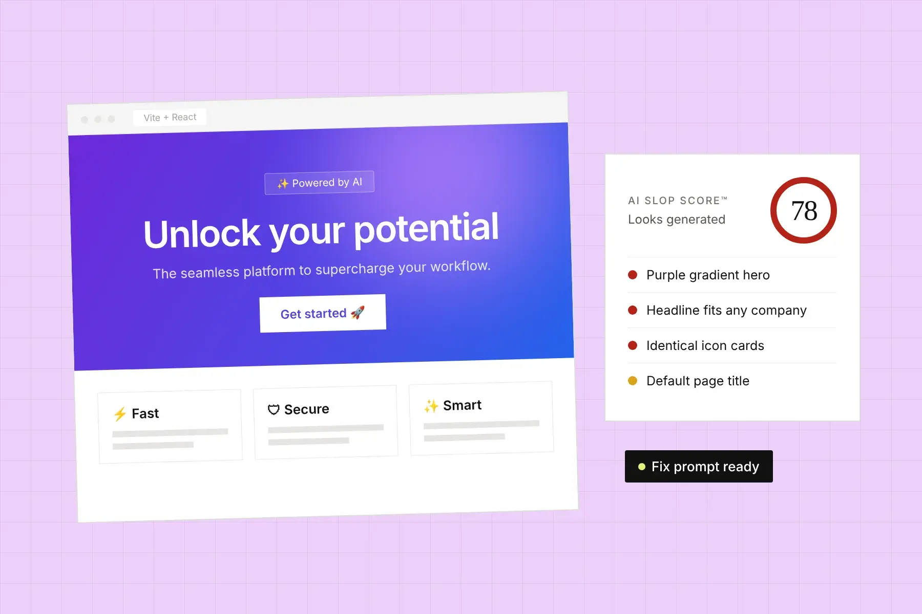
Inter on its own doesn’t make a site look AI-generated, but it removes one of the easiest ways to look different. Visitors don’t consciously notice fonts. They notice when a page feels like every other page, and typography is a big part of that feeling. Inter plus a purple gradient plus three identical feature cards reads as a template. Inter on a page where everything else was chosen with care mostly reads as clean.
That’s why typography is one of the heavier checks in Honello’s AI slop checker, but only one of nine. A font swap alone won’t fix a generic site. It’s simply the cheapest change with the most visible effect.
Which fonts are most associated with AI-built websites?
The fonts most associated with AI-built websites are the ones builders and coding assistants pick when nobody specifies a font. Honello’s check flags these 11:
- Inter
- Poppins
- Manrope
- Plus Jakarta Sans
- DM Sans
- Space Grotesk
- Sora
- Outfit
- Urbanist
- General Sans
- Satoshi
It also flags pages with no custom font at all, where every heading falls back to the operating system’s default UI font. That reads as unstyled rather than generated, but the effect on trust is similar.
How do I check which font my website uses?
To check which font your website actually renders, open the page in Chrome, right-click a headline, choose Inspect, open the Computed tab, and scroll to Rendered Fonts at the bottom. Do the same for a paragraph and a button. The CSS can list a font that never loads, so check what’s rendered, not what’s declared.
Check more than the hero. AI builders often set a custom font on the headline and leave Inter on everything else, including buttons, navigation, and links.
What fonts should I use instead?
Use one font with real character for headings and a plainer, highly readable font for body text. The heading font carries your personality; the body font stays out of the way. All of these are free for commercial use and none are on the flagged list.
Serif heading fonts
- Fraunces (Google Fonts): soft, warm, and a little old-fashioned. Good for food, wellness, publishing, and consumer brands.
- Instrument Serif (Google Fonts): condensed and elegant. Works for editorial, fashion, and studios.
- Newsreader (Google Fonts): built for reading, with a serious, journalistic feel. Good for B2B and expertise-led brands.
- Gambetta or Zodiak (Fontshare): sharper, higher-contrast serifs for brands that want to feel premium.
Sans-serif heading fonts
- Bricolage Grotesque (Google Fonts): quirky, slightly irregular shapes. Friendly without being childish.
- Cabinet Grotesk or Clash Display (Fontshare): bold, tight display faces for products that want to feel confident.
- Schibsted Grotesk or Familjen Grotesk (Google Fonts): grotesques with more personality than Inter, still easy to read.
Body fonts
- Source Serif 4 or Literata (Google Fonts): serif body text for long-form, content-heavy sites.
- IBM Plex Sans, Public Sans, or Instrument Sans (Google Fonts): neutral sans-serifs that don’t read as the default.
- Switzer (Fontshare): a clean workhorse sans with slightly more character than Inter.
If you love Inter for body text, keep it. Readability matters more than a score. Just know that the typography check looks at headings, paragraphs, buttons, and links together, so it will still flag Inter anywhere on the page. Put your effort into a heading font that clearly isn’t a default.
How do I pair a heading font with a body font?
Pair fonts by contrast, not similarity. Two different sans-serifs that look almost alike create a muddy page; a serif heading with a sans-serif body, or a bold display face with a quiet text face, makes the hierarchy obvious. Three rules cover most cases:
- Use two fonts at most. One for headings, one for everything else. A third font almost always makes a page feel less designed, not more.
- Make the difference obvious. If someone can’t tell the heading font from the body font at a glance, pick a heading font with more contrast.
- Match the mood to the business. A law firm and a skate brand shouldn’t share a heading font. Pick the one that sounds like you would if you were talking to a customer.
How do I change the font in Lovable, Bolt, v0, or Cursor?
Tell the builder exactly which fonts to use, where to load them from, and where to apply them. Vague requests like “make the typography more unique” usually get you a different default. A specific prompt works better:
Replace every font on the site. Load Fraunces (weights 400 and 600) and Instrument Sans (weights 400, 500, and 600) from Google Fonts. Use Fraunces for all h1, h2, and h3 elements. Use Instrument Sans for body text, buttons, navigation, links, and form fields. Remove Inter and any other font imports. Update the Tailwind config so font-sans is Instrument Sans and add font-display for Fraunces. Don’t change layout, colors, or copy.
After the builder finishes, check Rendered Fonts again in DevTools. Builders often miss buttons and form fields, which inherit fonts differently from headings and paragraphs.
Is changing the font enough to stop my site looking AI-generated?
No. Changing the font is the fastest single improvement, but most generated sites share several patterns at once: a default color palette, a purple-to-blue gradient, generic headline copy, emoji icons, and grids of identical cards. Fixing one helps; fixing the three or four strongest is what changes how the site feels.
For the full list of signs, see how to tell if your website looks AI-generated. To see which patterns your own page has, and how strongly, run it through the AI slop checker. It checks the fonts your page actually renders, along with eight other patterns, and gives you a prompt to fix each one.